
10 Inspiring Ideas from this Year's Decorator Showcase
San Francisco’s Decorator Showcase has come around again with the Historic “Le Petit Trianon” Mansion as the backdrop this year. The showcase featured nearly 50 West Coast designers and is a study in how to merge historic architecture with modern interiors (a challenge we’re currently tacking with our Victorian) We’ve culled a few of the most inspiring designs and a few trends we wouldn’t mind seeing more of. The event runs from April 27th-May 27th with tickets (priced at $40 for general admission) benefiting SFU High School so be sure to check it out for yourself. You can purchase tickets here.

de Gourney design, Martin Kobus Home | A glossy, pearl like finish, Susan Lind Chastain, Inc. & Willem Racké Studio
The Fifth Wall
Sometimes referred to as the fifth wall, the ceiling is often the most overlooked surface in a room. It’s also the largest uninterrupted surface making it the perfect canvas for experimentation. From gold leaf to wallpaper, to a glossy lacquered finish, designers this year directed your gaze upwards to dramatic effect.

Hand painted de Gournay wallpaper mural, ABH Interiors | A graphic print, Susan Lind Chastain, Inc. & Willem Racké Studio
Wallpaper and Murals
Wall coverings were everything and everywhere in the showcase. Most notable were the hand-painted masterpieces by de Gourney that treated the walls themselves as a work of art to dramatic effect. Luckily for those of us who can't afford to install their luxe designs (one can dream) along with the resurgence of wallpaper comes ever-expanding retail options.

A glossy cobalt blue, Jonathan Rachman Design | Electric pink, studioHEIMAT
RICH, SATURATED COLOR
Jewel tones are having a moment, and we’re not mad about it. They’re a natural counterpoint to the black and white palettes that we’re seeing crop up everywhere, and they interject a dose of color and glamour while still feeling refined.
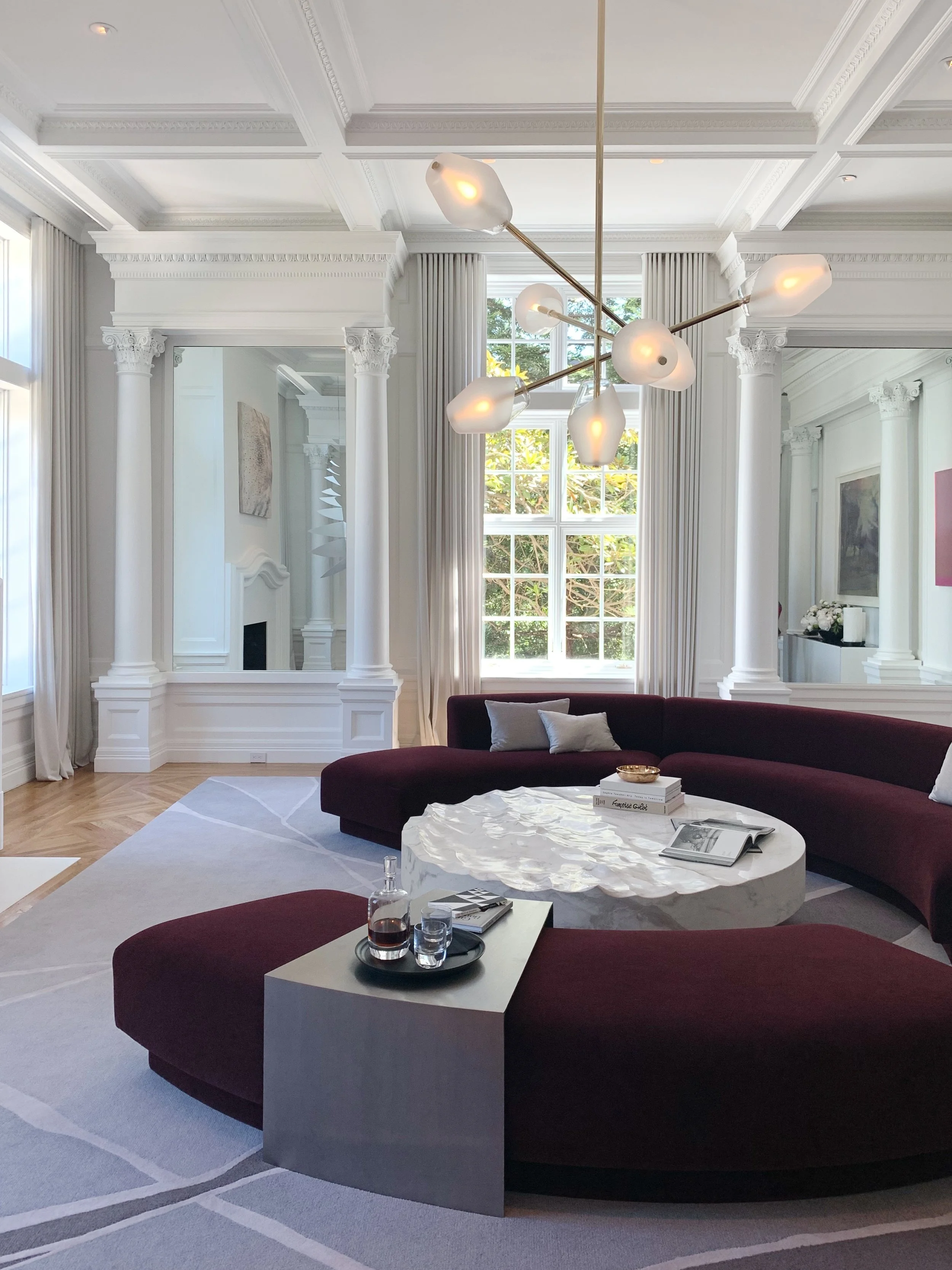
A circular conversation pit, Studio Collins Weir
CURVY FURNITURE
We’re calling this one as a trend you’ll be seeing more of (RH Modern even introduced a modular round sofa). We love how it breaks up the typical boxy lines of living room furniture and encourages you to move away from the wall, instead creating a natural conversation pit in the center of the room.

Modern art between traditional pillars, Studio Collins Weir
Old Meets New
I’m not ashamed to say I went into this year with an agenda. Since we’re remodeling our own 120+-year-old home, I was most interested to see how the designers merged the historic architecture with their modern designs, and they did not disappoint. As a nod to the history and function of the space they kept the original detailing a central character in their cast, mixing in modern pieces in a way that complimented rather than detracted from the existing architecture.

A sink with a beautiful inlay, Lauren Berry Interior Design | Brass buttoned switch plates, Navarra Design, Inc.
Minding the details
From lucite outlet covers that revealed the wallpaper beneath to brass-buttoned light switches, even the smallest detail was carefully considered. One oft-overlooked feature we loved this year was the treatment of trim and baseboards: from painting them to match saturated ceilings and walls for a monochromatic effect to choosing a colorful shade to complement the wallpaper.
Lime Washed walls in a moody blue, K Interiors, Bright white walls make the vibrant greens pop, ECHE
Bright and Light vrs Dark and Moody
One thing we observed on moving through the mansion was the dueling personalities of the rooms. From bright, light-flooded rooms painted all in white to their dark, moody counterparts forming a rich backdrop for furnishings, this year was one of extremes.

Layered to perfection, Jonathan Rachman Design
Collected Rooms
In a move away from the stark minimalism of years past, many of the rooms layered objects collected over time for a storied feel. We love the way they draw you in and communicate something of their inhabitants be they real or imagined.

Black and white for maximum contrast, Martin Kobus Home | A show-stopping table, Heather Hilliard Design
Statement Marble
Marble was abundant in the Versailles inspired manse, but the part that made us take notice was the move away from the clean, white marble with subtle grey veining that we’ve come to associate with the material. Designers instead chose dramatic black or heavily veined specimens.

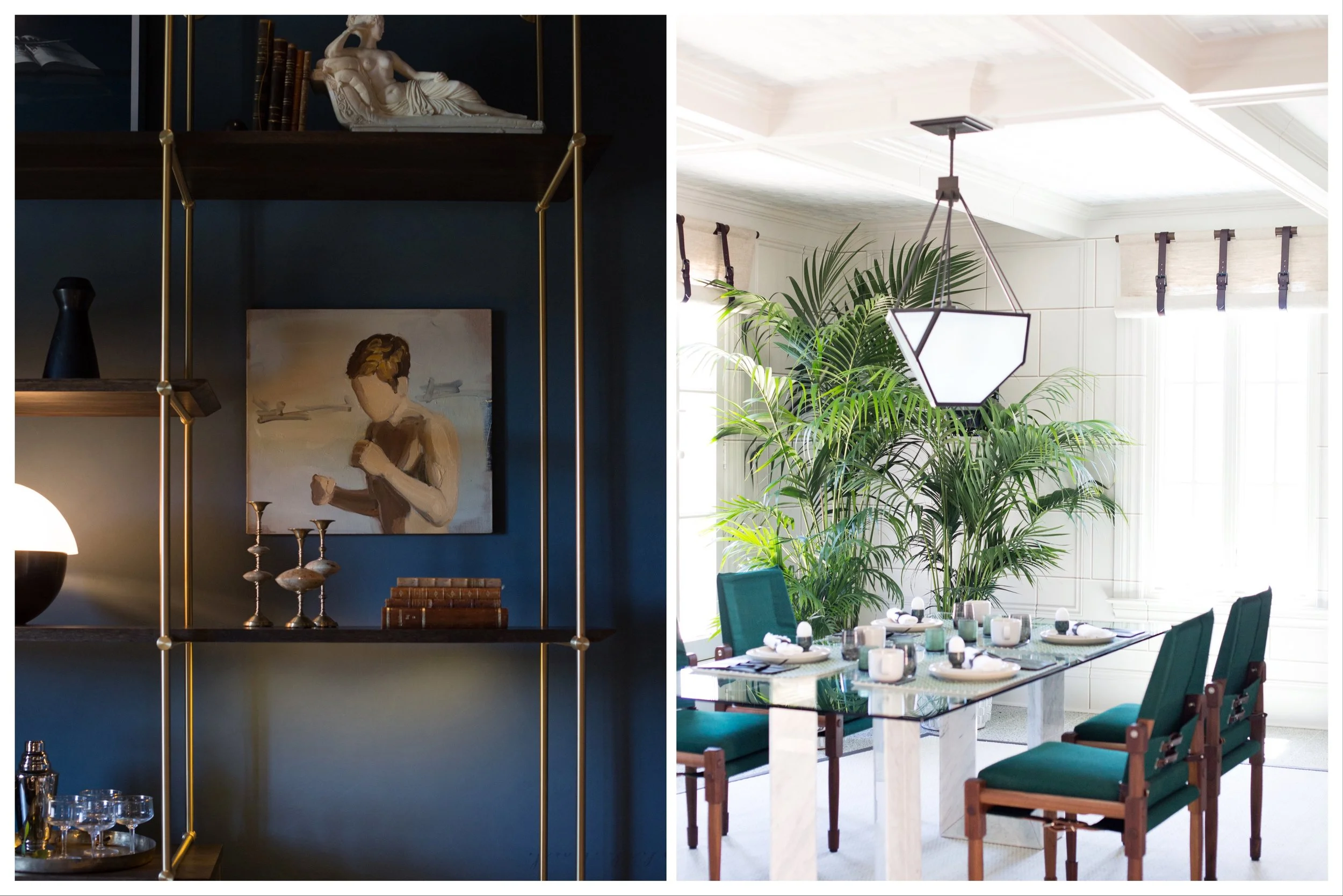
Iridescent beetles frame a vibrant room, studioHEIMAT, An insect motif is fitting for a butlers pantry turned potting shed, Kari McIntosh Design
Insect Motifs
While the idea of any sort of insect in the house usually makes me cringe, I love insect motifs. The perfect mix of edge and quirk, they work with a moody palette or a pretty, playful one depending on the effect you are going for.

